When you build a UI-only game, your layout is your gameplay. But that presents a massive design challenge: responsive design.
Responsive design isn’t just about making UI elements bigger or smaller. It is about adapting structural layouts to fit different screen sizes. Different display resolutions require different layouts. A player on a 4K monitor can use wide, multi-column views, while a player on a small screen needs a simple, compact layout to keep buttons easy to reach.
By default, Godot handles basic resolution changes through its built-in display scale modes (canvas_items or viewport). You set a target aspect ratio, and Godot automatically stretches or scales your Control nodes to fit the window. For many games, this uniform scaling works fine.
However, uniform scaling has major limitations:
-
The rendering pipeline: Godot’s rendering pipeline simply scales UI elements up and down. This can result in blurry and jagged text and visual elements.
-
Wasted space: A 4K monitor just gets an upscaled version of the UI rather than taking advantage of the extra room to show more information.
-
Layout rigidity: Out of the box, Godot lacks a native mechanism to automatically rearrange node hierarchies or switch container layouts based on pixel-width thresholds.
While Godot has a fantastic UI toolkit built around Control nodes and Containers, it lacks a built-in strategy to dynamically change container behavior based on window size.
In web development, this problem was solved years ago with Tailwind CSS.
Tailwind uses a prefix system that lets developers define responsive layout changes directly:
<div class="flex flex-col md:flex-row">That tiny md:flex-row class carries a simple instruction: “By default use a vertical column layout , but once the screen width crosses the Medium breakpoint threshold, switch to a horizontal row.”
That prefix model was the missing link for Godot. Instead of writing messy _on_resized() functions across every single UI script, we can bring Tailwind’s breakpoint philosophy into Godot’s node and signal ecosystem.
The core system
The core architecture breaks down into three simple steps:
-
Define the breakpoints: Map human-readable names (
SM,MD,LG) to pixel widths. -
Evaluate screen size: Check the current window width against those bounds.
-
Emit a signal on state change: Notify UI components only when crossing a threshold.
1. Defining the Breakpoint Schema
First, we create a helper class to define our breakpoint thresholds:
class_name BreakpointsSchema extends Node

enum Breakpoint { SM, MD, LG, XL, XXL }

# Thresholds based on Tailwind CSS documentation:
# https://tailwindcss.com/docs/responsive-design
const BREAKPOINTS: Dictionary = {
	Breakpoint.SM: 640,
	Breakpoint.MD: 768,
	Breakpoint.LG: 1024,
	Breakpoint.XL: 1280,
	Breakpoint.XXL: 1536,
}
2. Evaluating the Current Breakpoint
Next, we write a static function to determine which breakpoint bracket the current window fits into:
static func get_current_breakpoint(screen_size: Vector2) -> BreakpointsSchema.Breakpoint:
	var width:float = screen_size.x

	# Extract and sort breakpoint keys from largest threshold to smallest
	var sorted_keys:Array = BreakpointsSchema.BREAKPOINTS.keys()
	sorted_keys.sort_custom(func(a, b): return BreakpointsSchema.BREAKPOINTS[a] > BreakpointsSchema.BREAKPOINTS[b])

	# Return the first (largest) breakpoint threshold the screen satisfies
	for bp in sorted_keys:
		if width >= BreakpointsSchema.BREAKPOINTS[bp]:
			return bp

	# Fallback to the smallest breakpoint if under all defined thresholds
	return sorted_keys.back()
3. Creating the Global UI Rules Manager
Finally, we tie this evaluation to Godot’s root viewport resize events. By caching the active state, we ensure we only emit signals when a breakpoint threshold is actually crossed, preventing unnecessary UI redraws on every single pixel of window movement. One small nuance is the scale_factor. We need this because if the user uses the OS scaling feature, the window size can get quite large, which leads to returning the incorrect breakpoint.
class_name UIRules extends Node

signal breakpoint_changed(new_breakpoint: BreakpointsSchema.Breakpoint)

var current_breakpoint: BreakpointsSchema.Breakpoint

static func get_current_breakpoint(screen_size: Vector2) -> BreakpointsSchema.Breakpoint:
# ...

func _ready() -> void:
	current_breakpoint = get_current_breakpoint(get_viewport().size)
	get_tree().root.size_changed.connect(_on_viewport_size_changed)


func _on_viewport_size_changed() -> void:
	var new_size:Vector2 = Vector2(DisplayServer.window_get_size())

	var scale_factor = DisplayServer.screen_get_scale()
	var real_size:Vector2 = new_size / scale_factor

	var new_bp = get_current_breakpoint(real_size)
	if new_bp != current_breakpoint:
		current_breakpoint = new_bp
		breakpoint_changed.emit(current_breakpoint)
Tip: Register
UIRulesas an Autoload (Singleton) in your Godot project settings (Project -> Project Settings -> Autoload). This gives any UI component in your game instant access toUIRules.breakpoint_changed.
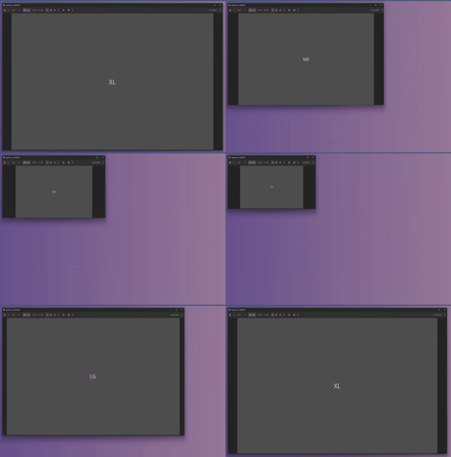
Who is going to listen?
Because we registered UIRules as a Singleton, any script in our project can listen to breakpoint changes and adjust its layout.
However, writing repetitive signal connections across dozens of UI components gets messy fast. To keep things modular and sophisticated, we can build a reusable base class:
class_name UIUpdater extends Node


func _ready() -> void:
	UiRules.breakpoint_changed.connect(_on_breakpoint_changed)
	_update_gui_bp(UiRules.current_breakpoint)


func _on_breakpoint_changed(new_breakpoint: BreakpointsSchema.Breakpoint) -> void:
	_update_gui_bp(new_breakpoint)


func _update_gui_bp(new_breakpoint: BreakpointsSchema.Breakpoint) -> void:
	pass
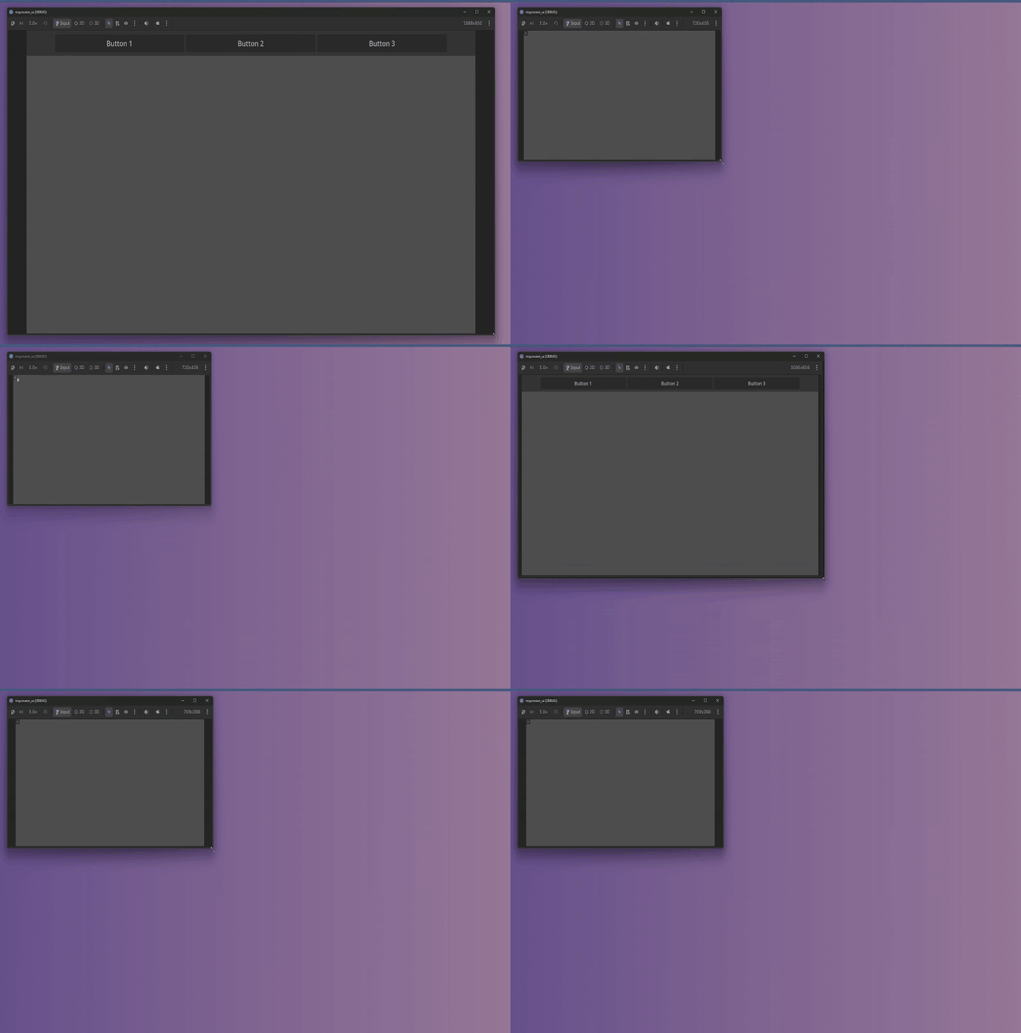
A Simple Burger menu
This base node automatically handles the signal connection to UIRules and triggers _update_gui_bp() both when spawned (_ready) and whenever the window size crosses a breakpoint boundary.
Now, we can add a simple UIUpdater to any scene, extend its script, and override _update_gui_bp() to define custom UI behavior:
extends UIUpdater


@onready var burger_menu = $"../BurgerMenu"
@onready var top_bar = $"../TopBar"

func _update_gui_bp(new_breakpoint: BreakpointsSchema.Breakpoint) -> void:
	match new_breakpoint:
		BreakpointsSchema.Breakpoint.SM:
			top_bar.visible = false
			burger_menu.show_component()
		_:
			top_bar.visible = true
			burger_menu.hide_component()
In this example, our menu updater seamlessly hides the desktop navigation bar and shows a mobile hamburger menu whenever the screen shrinks to the SM breakpoint threshold. All without cluttering the main scene logic or polling window sizes every frame.
Going Beyond Visibility: Responsive Layout Direction
Toggling component visibility is useful for menus, but true responsive design is about layout flow.
In Tailwind, you frequently write classes like flex flex-col md:flex-row. On small screens, elements stack vertically; on larger screens, they align horizontally.
Dr. Jekyll and Mr. Hyde
Sometimes, an entire component needs a visual identity shift depending on available real estate.
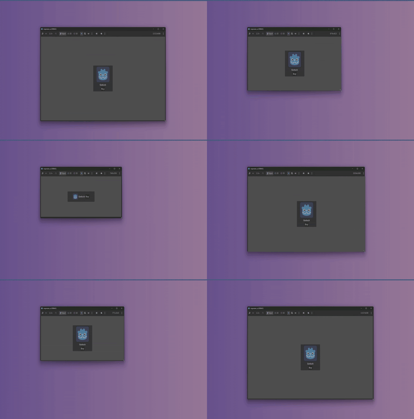
Take a standard Item Card containing an image, title, and price. On desktop, it might be a tall, vertical card. On mobile, it needs to shrink into a compact horizontal banner. Usually, developers either instantiate two entirely different scene files or write hacky scene-swapping code.
With our breakpoint system, we can morph the card layout cleanly in just a few lines of code using a script extending UIUpdater:
extends UIUpdater

const MAIN_PANEL_SM_SIZE: Vector2 = Vector2(250, 80)
const MAIN_PANEL_DEFAULT_SIZE: Vector2 = Vector2(180, 200)

const TEXT_RECT_SM_SIZE: Vector2 = Vector2(50, 50)
const TEXT_RECT_DEFAULT_SIZE: Vector2 = Vector2(128, 128)

@onready var box_container = $"../Panel/BoxContainer"
@onready var main_panel = $"../Panel"
@onready var text_rect = $"../Panel/BoxContainer/TextureRect"
@onready var root = $".."

func _update_gui_bp(new_breakpoint: BreakpointsSchema.Breakpoint) -> void:
	match new_breakpoint:
		BreakpointsSchema.Breakpoint.SM:
			root.custom_minimum_size = MAIN_PANEL_SM_SIZE

			main_panel.custom_maximum_size = MAIN_PANEL_SM_SIZE
			main_panel.custom_minimum_size = MAIN_PANEL_SM_SIZE
			box_container.vertical = false

			text_rect.custom_maximum_size = TEXT_RECT_SM_SIZE
			text_rect.custom_minimum_size = TEXT_RECT_SM_SIZE
		_:
			root.custom_minimum_size = MAIN_PANEL_DEFAULT_SIZE

			main_panel.custom_maximum_size = MAIN_PANEL_DEFAULT_SIZE
			main_panel.custom_minimum_size = MAIN_PANEL_DEFAULT_SIZE
			box_container.vertical = true

			text_rect.custom_maximum_size = TEXT_RECT_DEFAULT_SIZE
			text_rect.custom_minimum_size = TEXT_RECT_DEFAULT_SIZE
With this, the card adapts to MD size to comfortably fit horizontal scroll content while providing a slim version ready for vertical scroll containers.
Responsive Scroll Containers
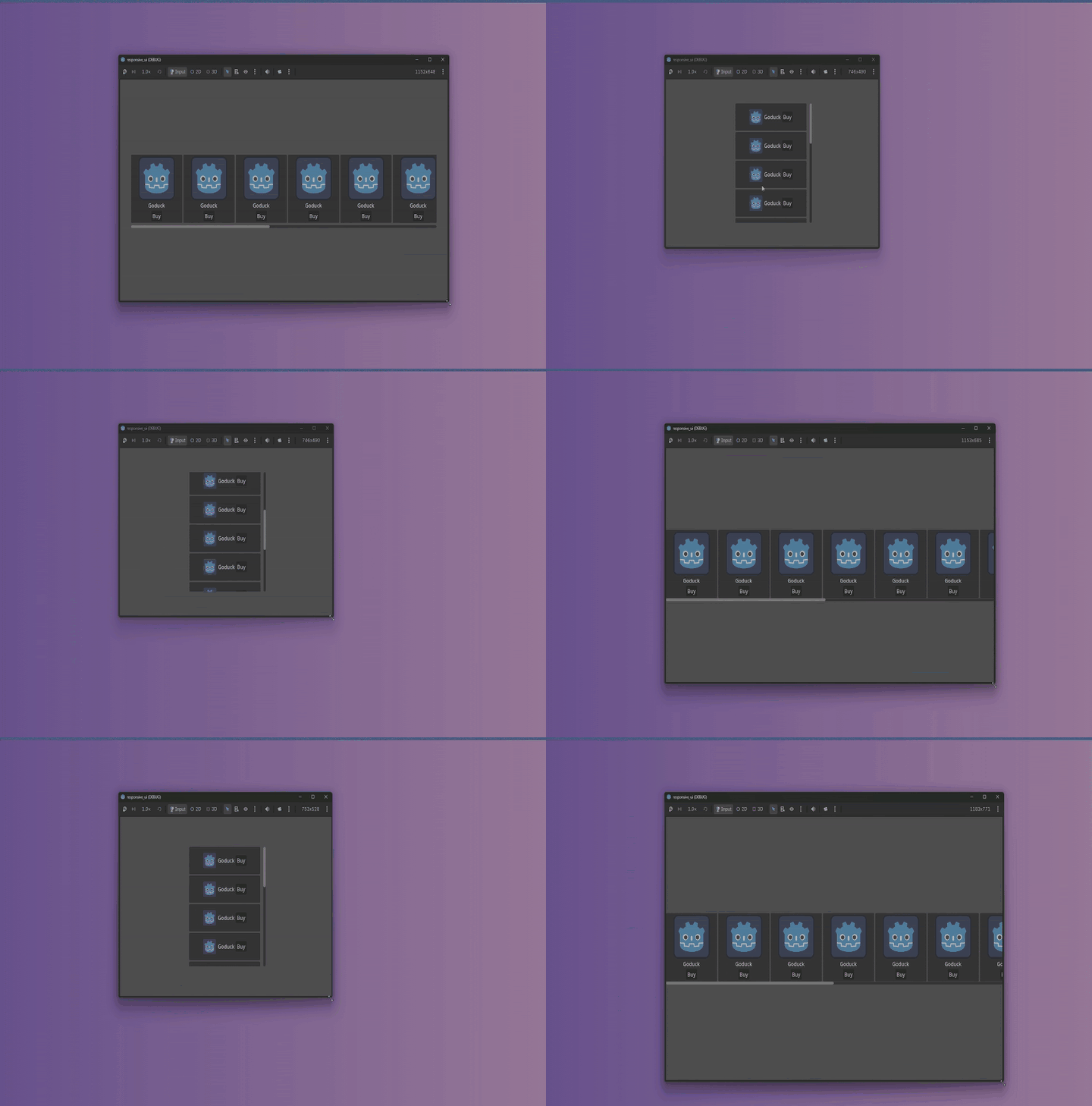
Both HBoxContainer and VBoxContainer inherit from BoxContainer. The superpower of BoxContainer is that it allows toggling its vertical property at runtime.
By wrapping our item cards inside a parent BoxContainer, we can make the parent scroll view completely change direction:
-
Desktop / High-Res (
MD+): The parent container setsvertical = false, lining up wide, tall cards into a Horizontal ScrollView. -
Mobile / Low-Res (
SM): The parent container setsvertical = truewhile individual cards switch to horizontal banners, creating a dense Vertical ScrollView.
extends UIUpdater

const SCROLL_SM_SIZE: Vector2 = Vector2(280, 350)
const SCROLL_DEFAULT_SIZE: Vector2 = Vector2(760, 210)

@onready var box_container = $"../ScrollContainer/BoxContainer"
@onready var scroll_container = $"../ScrollContainer"

func _update_gui_bp(new_breakpoint: BreakpointsSchema.Breakpoint) -> void:
	match new_breakpoint:
		BreakpointsSchema.Breakpoint.SM:
			box_container.vertical = true

			scroll_container.custom_minimum_size = SCROLL_SM_SIZE
			scroll_container.reset_size()

			scroll_container.set_anchors_and_offsets_preset(Control.PRESET_CENTER, Control.PRESET_MODE_KEEP_SIZE)

		BreakpointsSchema.Breakpoint.MD:

			box_container.vertical = false

			scroll_container.custom_minimum_size = SCROLL_DEFAULT_SIZE
			scroll_container.reset_size()

			scroll_container.set_anchors_and_offsets_preset(Control.PRESET_HCENTER_WIDE, Control.PRESET_MODE_KEEP_SIZE)
With just these simple node properties reacting to breakpoint signals, our UI transforms entirely between desktop and handheld formats, no duplicate scenes or fragile hacks required.
Conclusion: Web Architecture Meets Godot UI
By borrowing a proven web development concept and adapting it to Godot’s node and signal architecture, we solve responsive UI at the system level.
Instead of writing custom resize math across every scene or forcing a one-size-fits-all scale factor, we get:
-
Decoupled Architecture: Viewport sizing logic stays in a single Autoload (
UIRules), keeping component code clean. -
Zero Frame Polling: UI elements only recalculate when a breakpoint threshold is crossed.
-
Dynamic Layout Flows: Layouts seamlessly transform, swapping navigation menus, changing scroll directions, and morphing cards between desktop and handheld viewports.
If you’re building a UI-heavy game, stop fighting viewport scale modes. Give your Control nodes a set of breakpoint rules, and let them adapt naturally!
Support the Project & Grab the Code!
Want the complete working source code, the helper classes, and full sample scenes? Check out the Patreon-exclusive project file to download the project, and kickstart your game’s responsive UI system!